With all the fantastic free design tools, it can be tempting to overly format your resume. We can get caught up in a visually appealing resume with photos, colors, fonts, and beautiful design. It might look great, but it won’t get you noticed (for the right reasons). As backward as it sounds, clean and simple are best.
Most resumes are run through the Applicant-Tracking System (ATS) and sorted. Then, they are read by Recruiters and Hiring Managers. Overly formatted resumes are distracting and often used to hide a lack of content. Design matters, but content is queen! Never fear, I’m here to help you format your resume for maximum impact!
According to Forbes, up to 90 percent of employers, including most Fortune 500 companies, use Applicant Tracking Systems (ATS) to manage candidate applications. So how do you stand out without standing out?
Put Pen to Paper
I’ve said it before, and I’ll say it again, you must write first and edit, design, and format later. It’s too hard to do both at the same time and if you try, you’ll lose details because you’re overly focused on design. Or vice versa. You’ll have an amazing design with no content (please stay away from overly formatted Canva templates).
You don’t want to try to fit your story into a box, instead, you want to design the box around your story. Think about your narrative, define your value proposition, and market yourself. You bring experience and value, so don’t try to use your friend’s old resume as a template. Start from scratch and build out your story, tell us why you’re unique. It’s SO much easier to design around an amazing story than it is to try to fill up a design with some bullets. If you’re struggling with this step, I recommend downloading my Modern Resume Workbook here.
The Devil is in the Details
When you write out your accomplishments, think about what you actually do, not what your job description says. In fact, don’t even look at your job description. Think about how you would explain your job to a friend or a colleague. Now, go back and add more details. Examples might include titles of people you interact with; frequency of projects; budgets; team members; number of clients, etc.
Now you’re ready to turn it into a bullet. You can use the SAR formula to help you:
Situation, Action, Result.
Briefly explain the situation or context. Then provide details about the actions you took and end with the results you delivered. If you have a number, goal, or percentage to add here that makes it even better.
Make sure that your bullets answer the “so what” question. So, what was the impact of your action? How did it positively impact the organization?

Font Matters
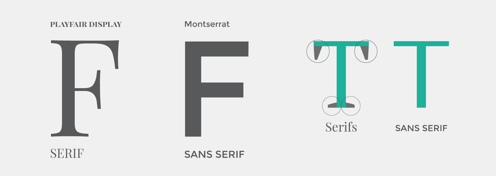
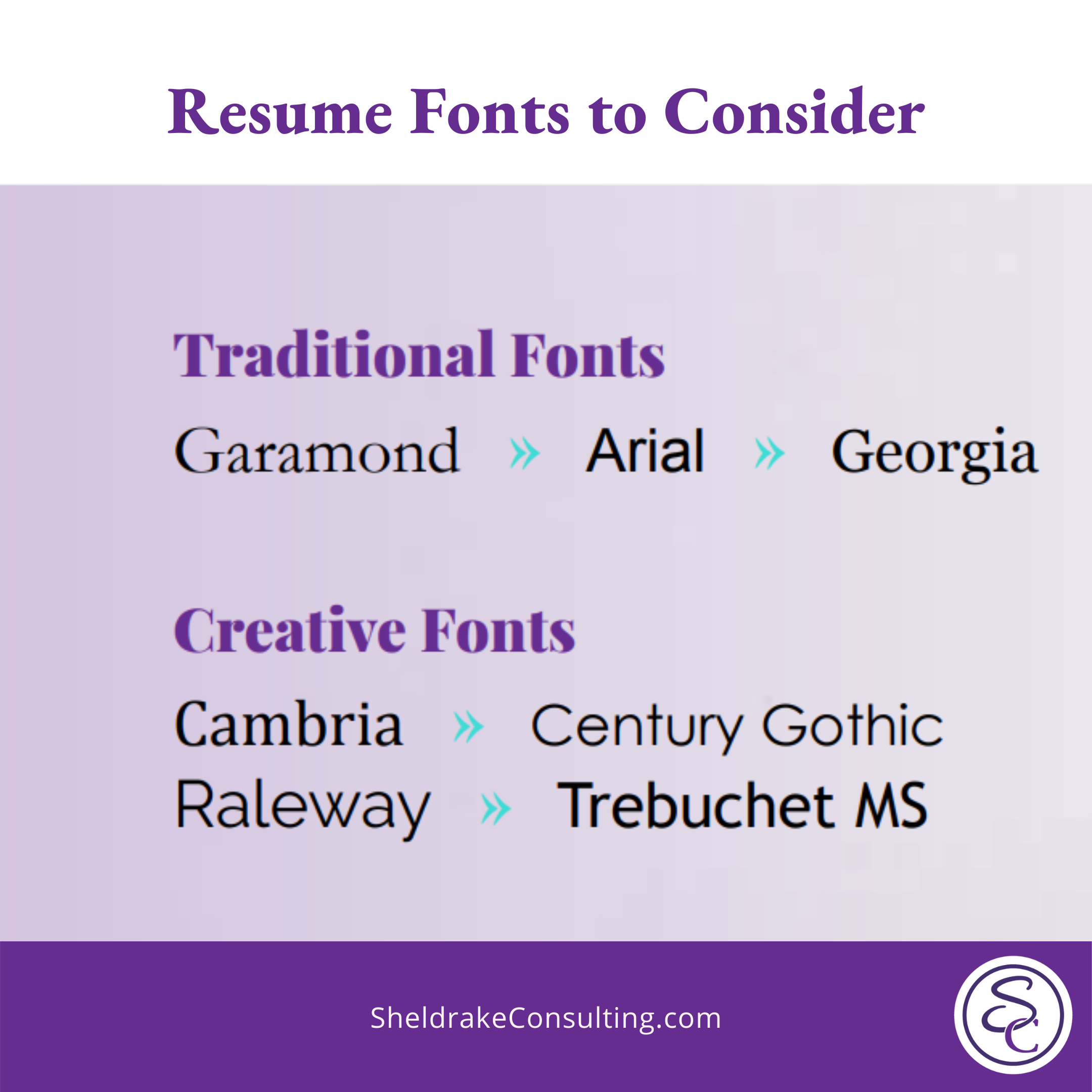
Resist the urge to play around with fonts. You can use two fonts when you format your resume, one Serif and one Sans Serif. Serif fonts have small features on the ends of strokes in some fonts and San Serif fonts don’t.
Whatever you decide, BE CONSISTENT throughout your resume. If all your headings are bold, Serif fonts, and your body text is regular, Sans Serif fonts, make sure that it’s the same throughout your entire resume. Have a friend review your resume only for the fonts on one of the passes because it’s easy to make a mistake here.
Do not use more than two fonts throughout the document. Choose one font for headers and one for text. Too many fonts are confusing and look messy.
While your document will be submitted electronically, it still needs to be visually appealing and easy to read. Give the reader’s eye a break with clear headings and plenty of white space. Margins should not be less than .5 inches. Fonts should not be smaller than 9 points.
Get Colorful
Surprise! You can use color to format your resume but do it sparingly. Color can showcase your personality, and your brand, and draw the reader’s eye to certain sections. You can underline, use colored text, or highlight/shade. If you use colors, it should be for section headers—not text—and should be versions of gray, blue, purple, or green.
Forget the Photo
I know you just took beautiful headshots for your LinkedIn page, but DO NOT use them on your resume. For one, it takes up valuable real estate that could be used to focus on your strengths and experience. Keep in mind that the average recruiter spends less than seven seconds reviewing your resume.
Using a resume photo could also lead to discrimination. Whether or not it’s conscious, someone could see your picture and discriminate based on race, age, gender, picture quality, or other factors. You don’t want that photo to be the reason you didn’t make it through the first round of resume reviews.
A resume photo may not come through the ATS in the way you want and skew what the recruiter actually sees. It could lead to an automatic rejection, which you don’t want. Once your resume makes it to the first round of calls, the recruiter will most likely look at your LinkedIn profile and see your photo there. But this way you’ve made it through the initial cut.
Ask for Help
If you’ve gone through your resume and you still feel like it’s not where you want it to be then it’s time to bring me in to help you! I create and review resumes for a living, so I promise you I’ve seen it all! No resume is too far gone to be fixed. Sometimes you just need an outside perspective to help you tell your story and highlight what a star candidate you are. If you are looking for some additional help to format your resume, schedule a consultation with me and I will give your resume a makeover!